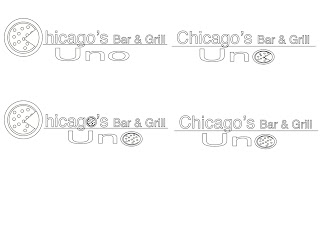
First set of designs for a specific look. I tried to make the business appear authentic and professional, and I think the font really hit the nail on the head here. If you like the look of it, you can find it at:
Fontspace.com under the name Chenier
Colored variations of the first set. Six pieces in all. I rather like the bottom left hand corner design. It definitely represents my audience which is Chicagoan's, Italian's, and Pizza-lovers alike.


No comments:
Post a Comment